The Studio Expansion

The Studio Expansion!
Here at MI&Co we are always thinking about ways we can ensure our customers get the best possible experience with the best possible results. We believe that we have one of the best studios in the country, and we are determined to prove that.
We absolutely love the classic white studio space that we have here in Shipley. We use a range of lighting equipment which enables us to create lots of different looks without moving the family too much. We can use bright background lights to create a crisp, fresh, white backdrop, or switch these off and focus the lighting on the family to create a more intense, darker, background in shades of greys and browns. (We also use different techniques in post production to add/remove shading to images which creates different looks). In 2015 we added two new sections to the existing space using a dark, warm wood and a light grey wood. These new backgrounds were a huge hit with all our customers and added something totally different to each families showreel.

In 2018 we moved the viewing room downstairs into the recently converted basement and that left us with a huge storage room upstairs. Mathew had always intended to use this space as a studio extension but we didn’t realise it would happen so quickly as we’re always so busy!
So… when we were forced to close during lock down it gave us a rare window of opportunity. As the space was sadly empty for the first time since we had opened we decided this was our chance to expand and add some new and exciting backdrops.
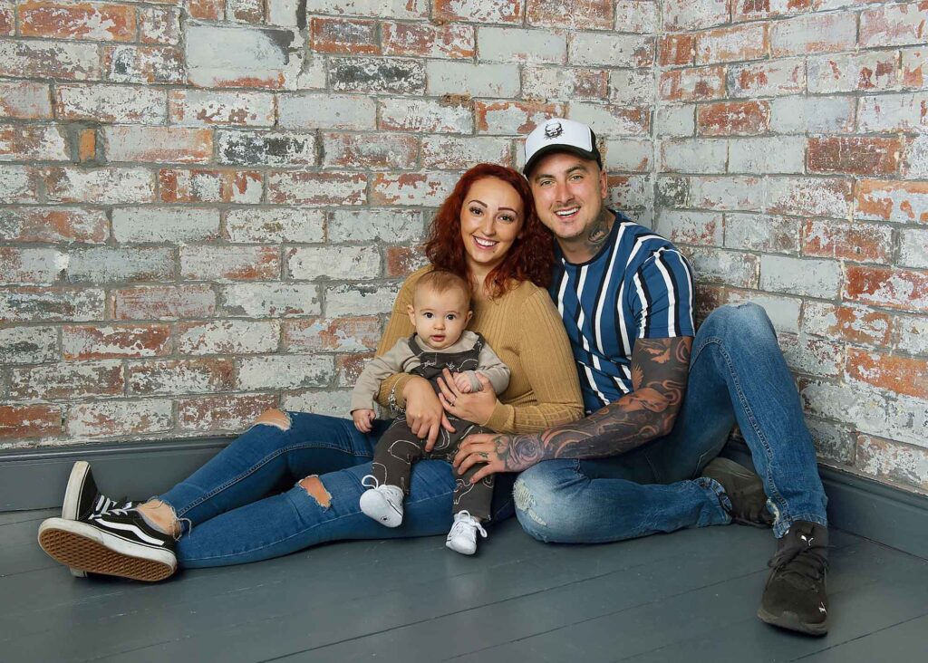
We love to see texture within our photography so decided to use that as a theme for our new room. When Mathew started tearing down the plasterboard he was excited to discover fantastic red brick beneath. He instantly knew we would keep this and create a striking feature corner! This new urban feel would suit all sorts of different families and we could already imagine how bright coloured clothes would really ‘pop’ against the red brick!

Next came the timber wall… original timber that we had found during the downstairs renovation. Mathew is a self confessed hoarder and SOMETIMES it pays off. This was one of those times. We decided to give the old timber a modern look. At the moment we have found that a lot of our families are loving Grey in their homes . During their viewings they are often choosing images to suit the Grey decor that they have at home. So, it was an obvious choice to create a White/Grey textured wash over the restored timber. We are SO pleased with the outcome. The vertical planks create an illusion of height in the images and contrast against the horizontal, light grey, wooden background previously mentioned.
![]()
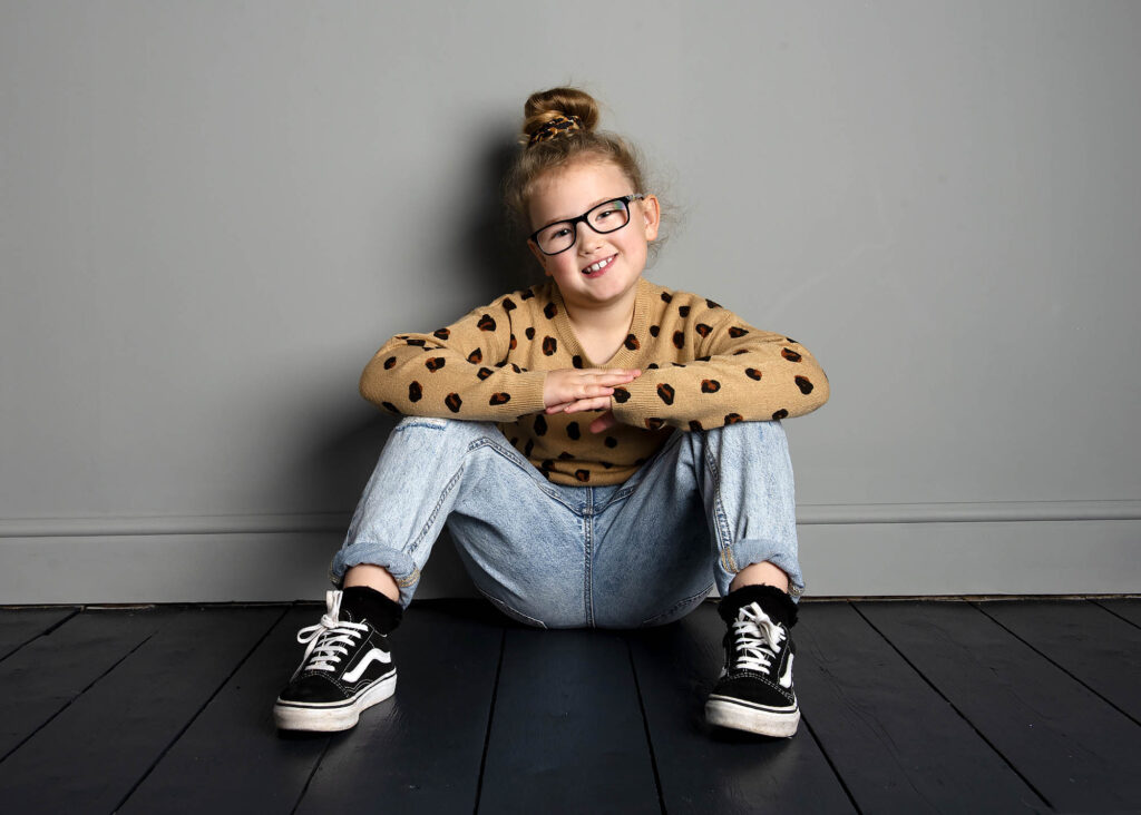
The final wall was something a little more simple, again sticking with the grey theme but this time smooth and crisp. When Mathew was tearing the space apart another fantastic find was the original floorboards. Although a little worse for wear we all agreed they would look fantastic with a little TLC and a lick of paint. Hence, we wanted this wall to complement the new darker flooring so we could create amazing full length shots with the texture and depth coming from the floor this time, rather than the wall.
We felt the Skillen family had the perfect personality and style to show off our new backgrounds and we are delighted that they are thrilled with their photos. Jessica said she ‘couldn’t have asked for anything better!’.